Nametrace - Predicting gender and region of origin from name
Introduction
In my research, I work a lot with data from social networks, trying to understand how users react to, for example, local exposure to refugees or how algorithmic content suggestions affect polarization. One question I constantly get asked in seminars is:
“Who are these users? Are they representative of the rest of the population?”
Predicting demographic data for users can be difficult and computationally intensive. It works quite well if you have access to users’ full profiles and their posted content (see, for example, our recent paper on this topic).
But sometimes you only have information on the name. For this purpose, I built nametrace, a simple Python package that provides a sleek and modern API to predict gender and region of origin from users’ names. With just the name, you can achieve pretty good accuracy for both gender (95.57%) and region of origin (66.55%).
For this introduction to nametrace, we will predict the gender and region of origin for all the researchers in the RePEc top 5% Economics/Finance authors list to reveal whether, and how, the distribution of authors at the top of the academic field is skewed in terms of demography.
Set-up
For this tutorial, let’s keep things organized and start a new project folder.
mkdir nametrace_example
cd nametrace_example
Let’s also create a virtual environment for this project and install nametrace.
python -m venv .venv
source .venv/bin/activate
pip install nametrace #for predicting the gender and region of origin
pip install pandas tqdm #for data wrangling
pip install plotly seaborn matplotlib #for plotting
nametracerequirestorch. On some platforms, the latest versions oftorchmight not be supported, and you may get an error message during the installation ofnametrace.nametracedoes not require the newest version oftorch. You can solve this issue by simply installing a version oftorchthat is compatible with your system. For example, on my Mac OS 12.7 with an Intel chip, I can only runtorch<=2.2.2. So I just install torch first and then follow up with nametrace:pip install "torch==2.2.2">pip install namtrace
Data
I have already downloaded and prepared the names of the authors listed in the top 5%. If you want to follow along, you can find the CSV file here or download it directly.
wget https://www.paulbose.com/assets/data/repec_5p_names.csv
Perfect, we’re ready to get started.
Using nametrace
First, let’s import the required packages:
# data wrangling
import pandas as pd
from tqdm import tqdm
tqdm.pandas()
# prediction
from nametrace import NameTracer
# visualization
import matplotlib.pyplot as plt
import seaborn as sns
import plotly.express as px
import plotly.graph_objects as go
from plotly.subplots import make_subplots
import plotly.io as pio
pio.renderers.default = "notebook"
Next, we want to load our data using pandas. Place the CSV file in your working directory, then:
df = pd.read_csv("/Users/paulbose/Documents/git/parobo.github.io/assets/data/RePEc_5p_names.csv")
print(df.head())
#   name
# 0 Daron Acemoglu
# 1 Muhammad Shahbaz
# 2 Yuriy Gorodnichenko
# 3 Rangan Gupta
# 4 John List
Great, all the authors are imported. Next, we can start with the predictions. nametrace has a class called NameTracer() that we can use to run our predictions.
nt = NameTracer()
Let’s quickly test that this works:
result = nt.predict("Will Smith")
print(result)
# {
# 'is_human': True,
# 'gender': 'male',
# 'subregion': 'Northern America',
# 'confidence':
#   {
#   'human': 1.0,
#   'gender': 0.9337253570556641,
#   'subregion': 0.39760878682136536
#   }
# }
Great, it’s working — Will Smith is correctly identified as human, male, and from North America. As you can see, nametrace provides a bit more info than we need for this task, e.g., confidence levels and whether the name is likely a human name. Here, we just need the gender and the region of origin (which nametrace calls subregion because it follows the UN subregion classification). We can quickly write a function that will only provide the information we need:
def predict(name):
    result = nt.predict(name)
    return result['gender'],result['subregion']
And apply it to our dataset:
df[['gender', 'subregion']] = df['name'].progress_apply(lambda x: pd.Series(predict(x)))
print(df.head())
#   name                gender      subregion
# 0 Daron Acemoglu      male        Eastern Europe
# 1 Muhammad Shahbaz    male        Southern Asia
# 2 Yuriy Gorodnichenko male        Eastern Europe
# 3 Rangan Gupta        male        Southern Asia
# 4 John List           male        Northern America
Ok, good, we have our predictions. Let’s see — the predictions aren’t perfect. Daron Acemoglu is originally from Turkey (Western Asia), but is identified as being from Eastern Europe. Part of the reason could be that his name is correctly spelled “Daron Acemoğlu,” but even so, the model will make mistakes — it’s a prediction, after all. Let’s look at the other names:
- Muhammad Shahbaz is originally from Pakistan; the model correctly identifies Southern Asia.
- Yuriy Gorodnichenko was born in Ukraine; the model again correctly finds Eastern Europe.
- Rangan Gupta did his studies in India, so Southern Asia is the correct label.
- John List was born in the US, so indeed Northern America is correct.
Overall, the model seems to be doing quite well.
nametracecan also handle batching, which may make predictions on large datasets much faster. See nametrace for more info. For now, we are fine with running individual predictions, since our dataset is small.
Results
We have checked some of the data; now let’s see how the authors are distributed. Let’s start by looking at the gender distribution of the top 5% of Economics/Finance authors.
# Set style
plt.style.use('seaborn-v0_8')
sns.set_palette("husl")
We’ll make both a bar chart and a pie chart to get the full picture:
# Gender Distribution Visualization
fig, (ax1, ax2) = plt.subplots(1, 2, figsize=(15, 6))

# Pie chart for gender
gender_counts = df.gender.value_counts()
colors = ['#ff9999', '#66b3ff']
wedges, texts, autotexts = ax1.pie(gender_counts.values, labels=gender_counts.index,
                                   autopct='%1.1f%%', colors=colors, startangle=90)
ax1.set_title('Gender Distribution', fontsize=16, fontweight='bold')

# Bar chart for gender with counts
bars = ax2.bar(gender_counts.index, gender_counts.values, color=colors, alpha=0.8)
ax2.set_title('Gender Distribution (Count)', fontsize=16, fontweight='bold')
ax2.set_ylabel('Count', fontsize=12)
ax2.set_xlabel('Gender', fontsize=12)

# Add count labels on bars
for bar in bars:
    height = bar.get_height()
    ax2.text(bar.get_x() + bar.get_width()/2., height + 20,
             f'{int(height)}', ha='center', va='bottom', fontsize=12, fontweight='bold')

plt.tight_layout()
plt.show()
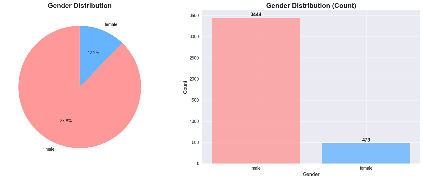
Wow, this is even more skewed than I imagined. Only 12.2% of the top authors are female. Hopefully, this picture will change in the future. This result actually tempted me to check more broadly how the distribution of gender and region has evolved among the top 5% of authors on RePEc in recent years. I won’t overload this post with the code for that analysis, but I will include a figure at the end of the post if you’re interested.
For now, let’s look at the regional distribution.
# World Map of Subregion Distribution
# Create a mapping from subregions to representative countries for visualization
subregion_to_countries = {
    'Northern America': ['USA', 'CAN'],
    'Western Europe': ['DEU', 'FRA', 'NLD', 'BEL', 'CHE', 'AUT'],
    'Southern Europe': ['ITA', 'ESP', 'GRC', 'PRT', 'HRV', 'SVN', 'MKD', 'ALB', 'MNE', 'SRB'],
    'Northern Europe': ['GBR', 'IRL', 'DNK', 'SWE', 'NOR', 'FIN', 'ISL', 'EST', 'LVA', 'LTU'],
    'Eastern Asia': ['CHN', 'JPN', 'KOR', 'PRK', 'MNG'],
    'Southern Asia': ['IND', 'PAK', 'BGD', 'LKA', 'NPL', 'BTN', 'AFG', 'MDV'],
    'Eastern Europe': ['RUS', 'POL', 'UKR', 'CZE', 'SVK', 'HUN', 'ROU', 'BGR', 'BLR', 'MDA'],
    'South America': ['BRA', 'ARG', 'CHL', 'PER', 'COL', 'VEN', 'ECU', 'BOL', 'PRY', 'URY', 'GUY', 'SUR'],
    'South-eastern Asia': ['IDN', 'THA', 'VNM', 'PHL', 'MYS', 'SGP', 'MMR', 'KHM', 'LAO', 'BRN', 'TLS'],
    'Western Asia': ['TUR', 'IRN', 'IRQ', 'SAU', 'SYR', 'JOR', 'ISR', 'LBN', 'ARE', 'KWT', 'QAT', 'BHR', 'OMN', 'YEM'],
    'Central America': ['MEX', 'GTM', 'CUB', 'HND', 'NIC', 'CRI', 'PAN', 'SLV', 'BLZ'],
    'Western Africa': ['NGA', 'GHA', 'CIV', 'MLI', 'BFA', 'NER', 'SEN', 'GIN', 'SLE', 'LBR', 'TGO', 'BEN', 'MRT', 'GMB', 'GNB', 'CPV'],
    'Northern Africa': ['EGY', 'LBY', 'TUN', 'DZA', 'MAR', 'SDN'],
    'Eastern Africa': ['ETH', 'KEN', 'UGA', 'TZA', 'RWA', 'BDI', 'SOM', 'ERI', 'DJI', 'COM', 'MUS', 'SYC', 'MDG'],
    'Southern Africa': ['ZAF', 'BWA', 'LSO', 'NAM', 'SWZ', 'ZMB', 'MWI'],
    'Middle Africa': ['COD', 'AGO', 'CMR', 'TCD', 'CAF', 'COG', 'GAB', 'GNQ', 'STP'],
    'Caribbean': ['CUB', 'DOM', 'HTI', 'JAM', 'TTO', 'BRB', 'BHS', 'GRD', 'LCA', 'VCT', 'ATG', 'KNA', 'DMA'],
    'Australia and New Zealand': ['AUS', 'NZL']
}

# Create data for the map
map_data = []
subregion_counts = df.subregion.value_counts()

for subregion, countries in subregion_to_countries.items():
    count = subregion_counts.get(subregion, 0)
    percentage = count / len(df) * 100 if count > 0 else 0

    for country in countries:
        map_data.append({
            'country': country,
            'subregion': subregion,
            'count': count,
            'percentage': percentage
        })

map_df = pd.DataFrame(map_data)

# Create the choropleth map
fig = px.choropleth(
    map_df,
    locations='country',
    color='percentage',
    hover_name='subregion',
    hover_data={'count': True, 'percentage': ':.1f%'},
    color_continuous_scale='Viridis',
    title='Geographic Distribution of Names by Subregion<br><sub>Color intensity represents relative occurrence (%)</sub>',
    labels={'percentage': 'Percentage (%)', 'count': 'Count'}
)

fig.update_layout(
    title_font_size=16,
    title_x=0.5,
    geo=dict(
        showframe=False,
        showcoastlines=True,
        projection_type='equirectangular'
    ),
    coloraxis_colorbar=dict(
        title="Percentage (%)",
        title_font_size=12
    ),
    width=1000,
    height=600
)

fig.show()
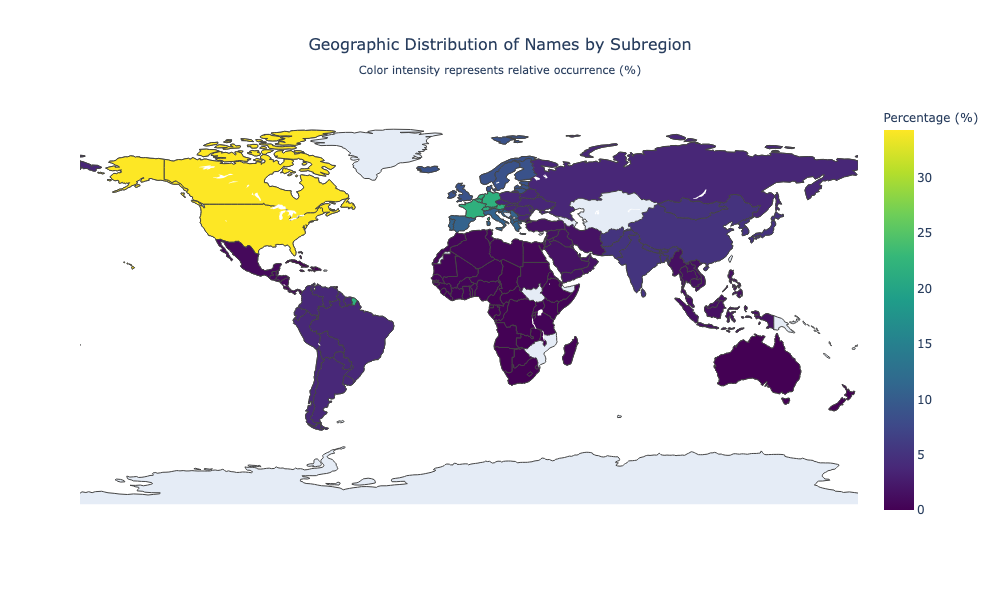
The map reveals that most of the researchers are either of North American or European origin. Of course, this is not super surprising, but it’s definitely a somewhat depressing result.
Conclusion
This was just a quick demo of how to use nametrace in your research and how it can help uncover demographic patterns in data where we only observe a person’s name.
See also the notebook for this article here.
Development over time (2013-2025)
As promised, here is a look at the development of the top 5% of authors over time. To construct the development over time, I used archive.org to collect the top 5% list from RePEc for 2013 until 2025. The first important thing to notice is that there was a large increase in the number of authors on RePEc over time, which of course increased the number of top 5% authors. So whenever we compare, e.g., the share of female authors over time, we have to keep in mind that the total number of authors also increased.
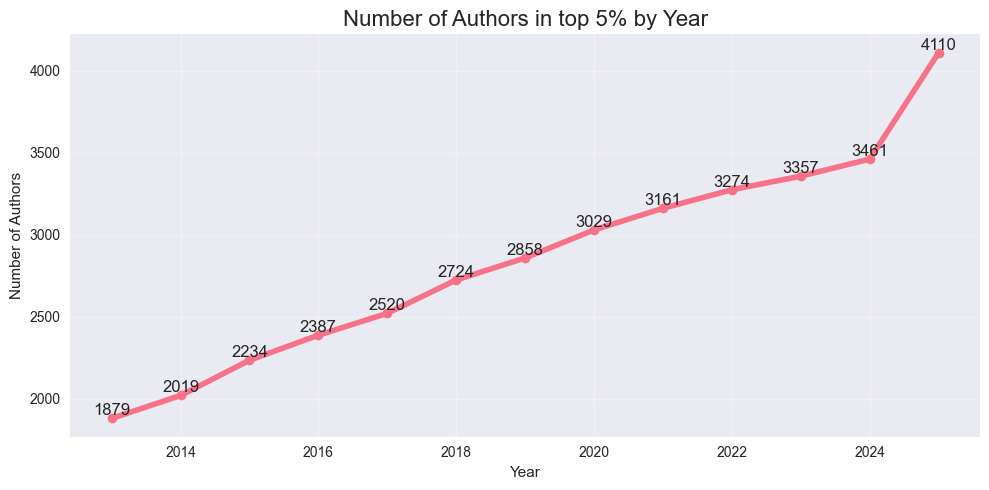
Another important point is that the RePEc ranking takes into account research from the past 10 years, so it is very slow to adapt and change. We shouldn’t see it as a reflection of current research output, but rather as a slowly adjusting ranking of past research output.
Share of female authors
But enough preamble, let’s look at the female share over time:
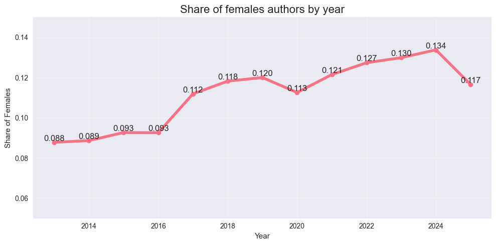
While the overall shares are low, there does seem to be a trend suggesting that female authors are rising in the rankings — especially given the increase in the total number of authors in the top 5%.
Region of origin
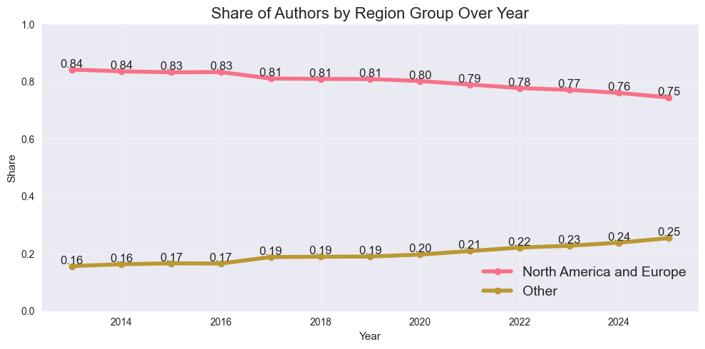
We can also study the region of origin of these authors. I decided to compare the share from the dominant regions (North America and Europe) to the rest of the world. We can clearly see a positive trend: economists from the rest of the world are having an increasing influence. While the share of authors in the top 5% was only 16% at first, it gradually increased to 25% by 2025.
But which regions are driving this increase? I took a look at the number of authors from each of the “smaller” regions.
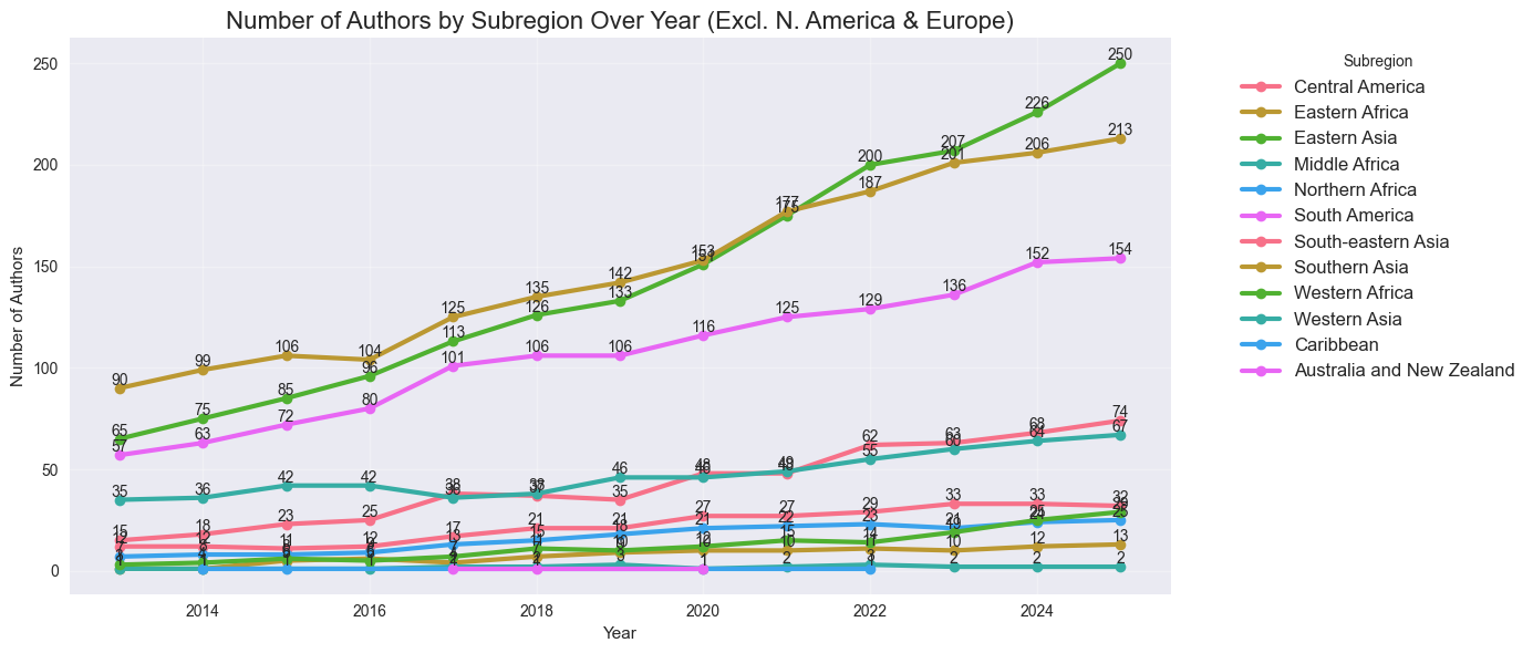
Mainly three regions are driving the increase in the share of authors from “the rest of the world” – Eastern Asia, Southern Asia, and South America. Of course, this is good news for these regions and for everyone, but we still see that e.g. Africa is enormously underrepresented.
Gender and region of origin
Finally, I wanted to understand which regions are driving the increase in the female share in the top 5%.
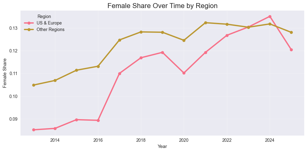
It seems that while the US, Canada and Europe were lagging behind in terms of female economists in the top 5% on RePEc, they have caught up in recent years. Nevertheless, all regions still have a long way to go.